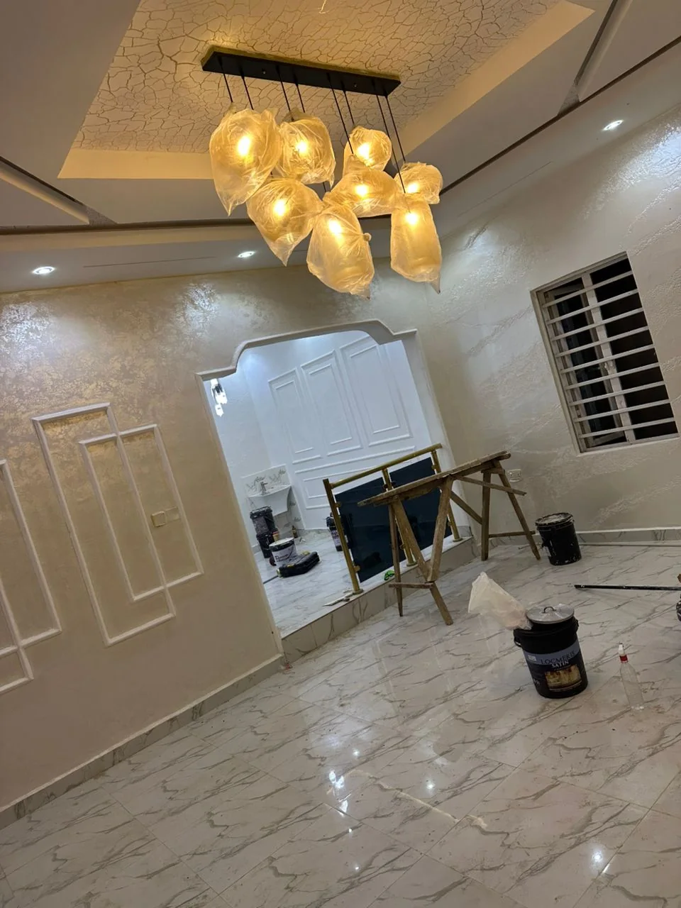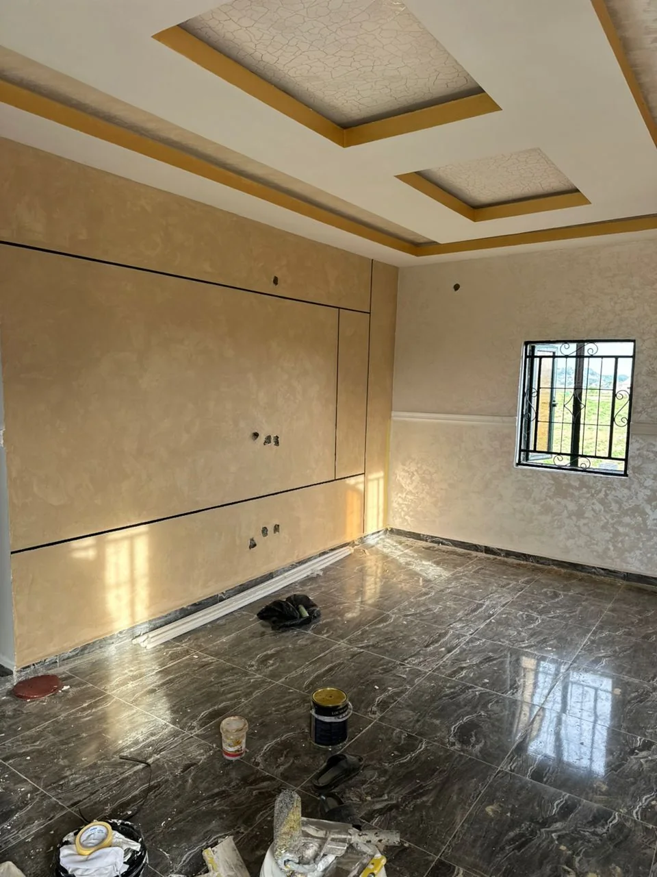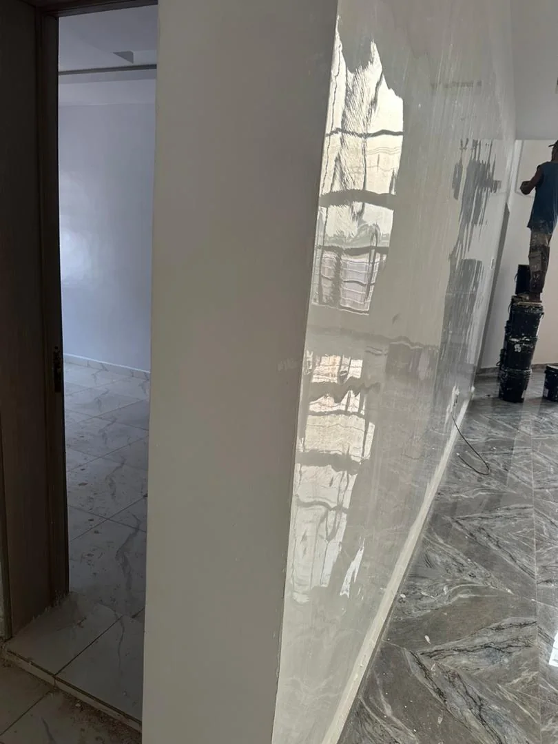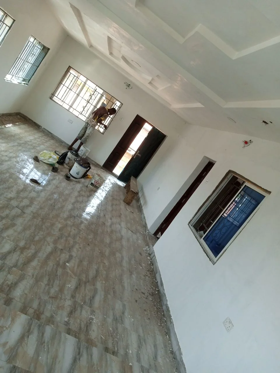
A successful colour scheme works with the building, not only with a trend. Floors, tiles, doors, ceilings, furniture and daylight all affect how a painted colour appears.
Begin with fixed elements
Identify the finishes that will remain: floor tiles, kitchen units, wardrobes, stone, curtains and major furniture. These usually cost more to change than paint, so the wall palette should relate to them.
Study the light
A colour can look cool in a bright room and warmer under evening bulbs. Place a sample on more than one wall and check it at different times. Do not approve a whole building from a phone image alone.
Use neutrals deliberately
Cream, warm white, beige, greige and light grey are useful foundations, but their undertones matter. A neutral that fights the floor colour can feel wrong even when both finishes look attractive separately.
Control feature colours
A deeper or more decorative wall works best when it has a purpose, such as framing a television wall, reception desk, headboard or artwork. Repeating a small part of that colour elsewhere can make the scheme feel connected.
Think about maintenance
Very pale colours may show marks in busy passages, while very dark colours can reveal dust or uneven preparation. Choose the paint product and sheen alongside the colour.
Keep transitions clear
Open-plan spaces benefit from a consistent base colour. Changes can happen at architectural breaks, feature walls or clearly defined zones rather than at arbitrary points.
Collect photographs of the rooms and fixed finishes before a colour consultation. A useful palette should explain where each colour starts, what sheen it uses and how it responds to the space.
Planning a painting project?
Tell us about your space and we’ll send a clear quote with timelines.